


RAY’S Place takes new name, reflective of new role
The board of RAY’S Place held a planning session to evaluate strengths and opportunities and to start creating a strategic plan to be implemented over the next five years.
One of the discussions considered the name of the Creemore-based charity and how in 2008, it had a physical location and was called RAY’S Place (Rent-a-Youth Resource Centre) to help local students find employment. After cancelling the youth hiring program, RAY’S Place evolved into an educational support program for local youth.
Marketing Chair Anna-Lisa Mantesso felt it was important to learn about the history of RAY’S and talked with people who were involved in the past as well as with members of the community.
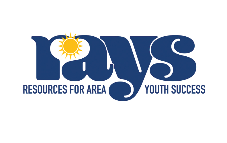
What Mantesso learned from her research is that there was high awareness and positive brand image in the RAY’S Place name and the initial rent-a-youth program. Conversely, many were unsure whether it still existed or what RAY’S now did. Mantesso said, “We can honour the past by leveraging the strong brand equity in the name RAY’S and dropping the word, Place. We need to give the name new meaning in order to build on the strength of the past.” The board decided to evolve the marketing name to RAYS, an acronym for Resources for Area Youth Success.
RAYS programs currently offer financial assistance to help students attend universities, colleges and trade courses as well as ongoing support through mentoring and career workshops.
With the marketing name agreed on, the first step was in creating the logo and brand identity. Mantesso reached out to Laurie Copeland, owner of Cardboard Castles and previous RAY’S Place board member, where they shared information about the then and now of the organization. Along with founding chair of RAYS, Tony Fry, Copeland had been involved with RAY’S Place from its inception and for many years after.
Mantesso asked Copeland if she would assist in redesigning the logo as she had designed the most recent logo. Copeland agreed once again to pitch in and help. The task was to ensure it appealed to both primary customers: students and donors.
Copeland said, “In discussing the history of the association, we decided that we wanted to preserve some of the branding behind RAYS. The important aspect of course, being the ray of hope that it could provide for Creemore-area youth in continuing their education. We carried forward the colour theme of blue/yellow and the symbol of the sun, but enriched the colours and design to illustrate a more mature and transitioned organization. The Creemore ‘heart’ is also hidden in the logo to emphasize the town’s tag, “little village with a big heart”.
Mantesso sat down with Fry, to talk with him about the evolution of RAYS and to show him the new logo.
Fry said, “The rebranding is fantastic. It picks up on the history and people will see this as a new venture in supporting youth.” He added, “The acronym for RAYS, Resources for Area Youth Success, is perfect as it was always about helping youth succeed and now it has evolved to providing scholarships and bursaries for post secondary education and also offers to mentor youth to support them in reaching their goals.”
